BRANDING
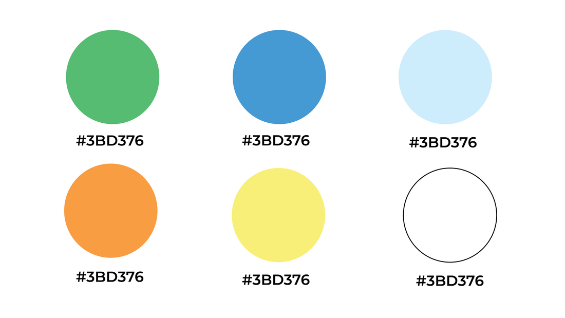
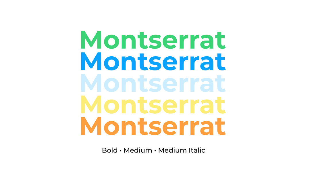
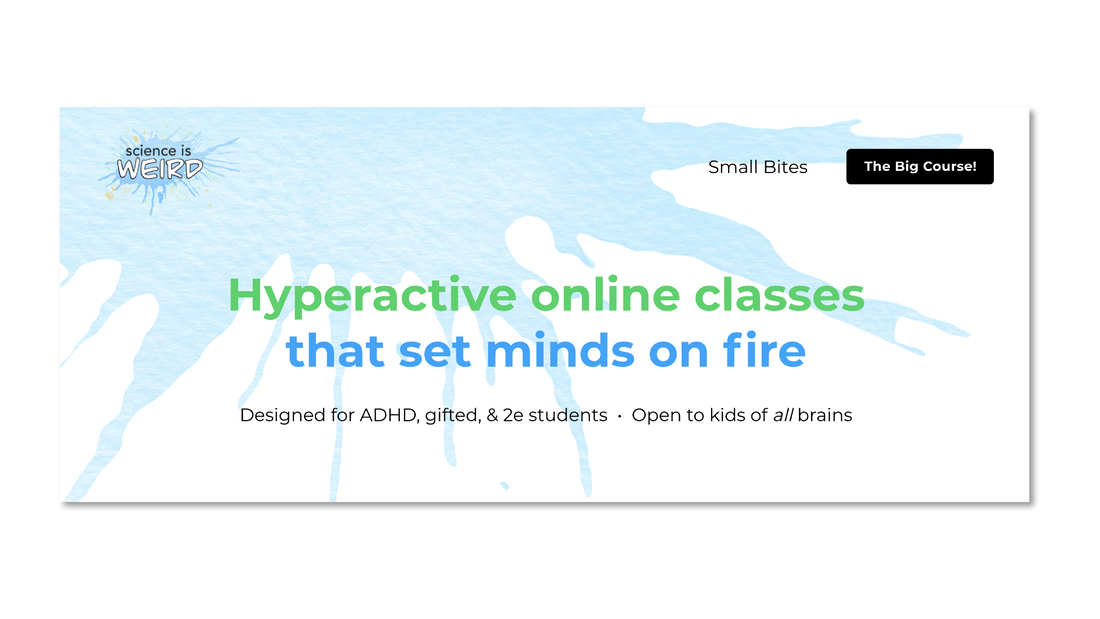
Here are the color options and layout that I provided for "Science is Weird". I wanted it to look "science-y" but also fun and loose, because that is how the instructor teaches his classes. I knew the instructor wanted to have a ton of fun with the illustrations, so I wanted to keep the type face as simple and readable as possible, so the website wouldn't look overwhelming, which was my main concern from the original site.
Here are the color options and layout that I provided for "Science is Weird". I wanted it to look "science-y" but also fun and loose, because that is how the instructor teaches his classes. I knew the instructor wanted to have a ton of fun with the illustrations, so I wanted to keep the type face as simple and readable as possible, so the website wouldn't look overwhelming, which was my main concern from the original site.
|
|
WEBSITE
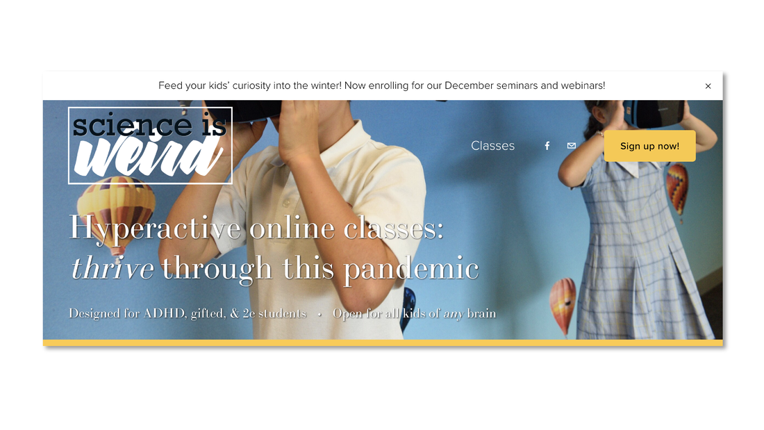
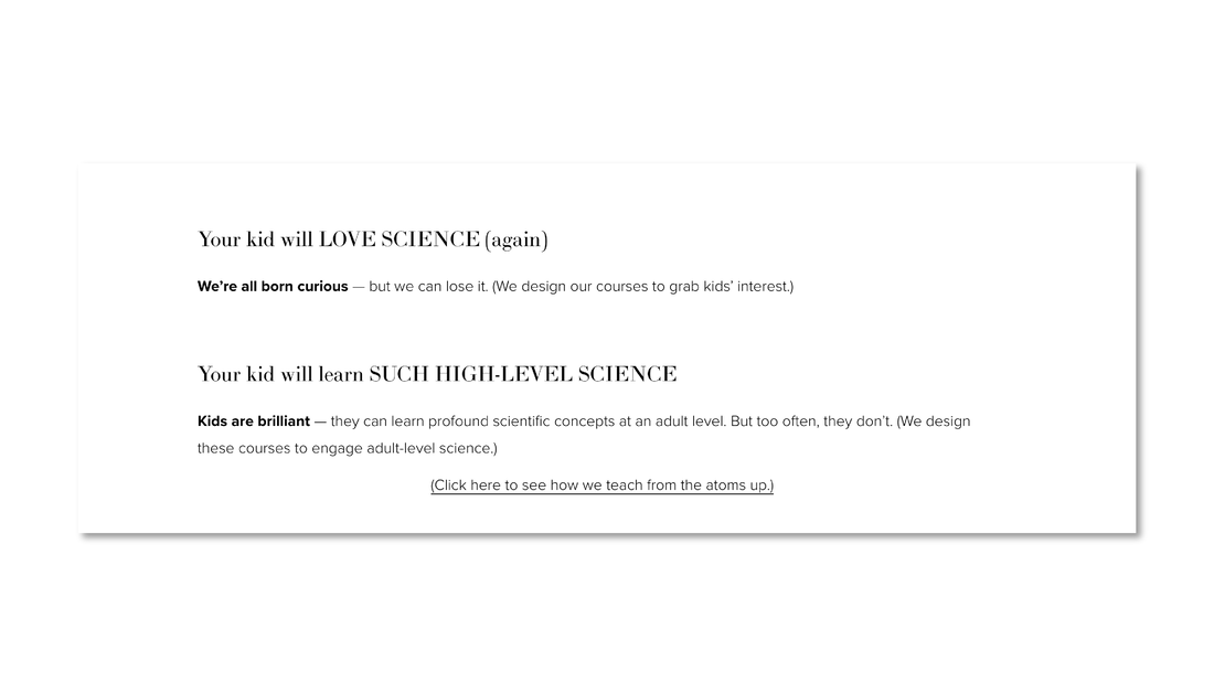
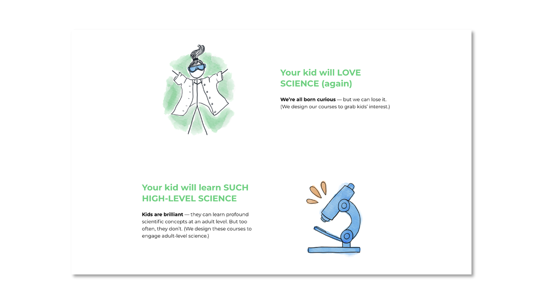
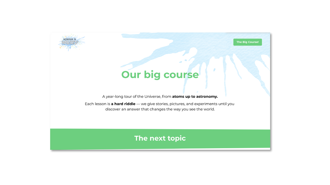
The was a tricky project. This was my first time re-doing a website and the company was new, but already has a website, so everything was being re-done and re-organized as we went along, which made having a clear direction tricky, but I am really happy with how it turned out! Below are some "before" and "after" photos.
The was a tricky project. This was my first time re-doing a website and the company was new, but already has a website, so everything was being re-done and re-organized as we went along, which made having a clear direction tricky, but I am really happy with how it turned out! Below are some "before" and "after" photos.
b e f o r e
after
before
a f t e r
b e f o r e
a f t e r
|
|
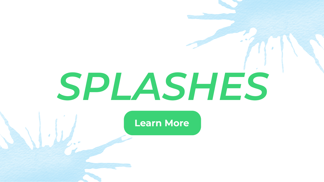
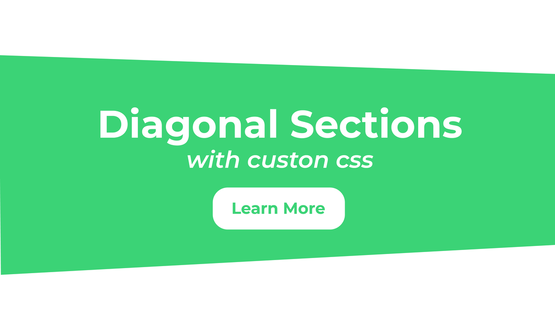
I added splashes to the title of each page, to keep each page looking spunky, as well as diagonal slashes to make text blocks more pleasing to the eye.
ADS
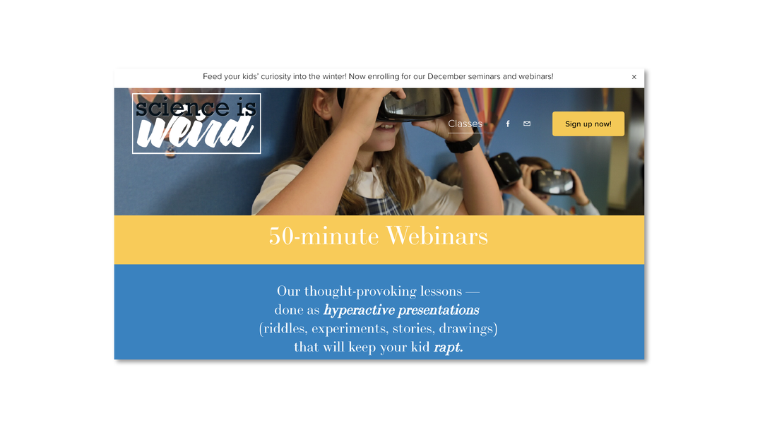
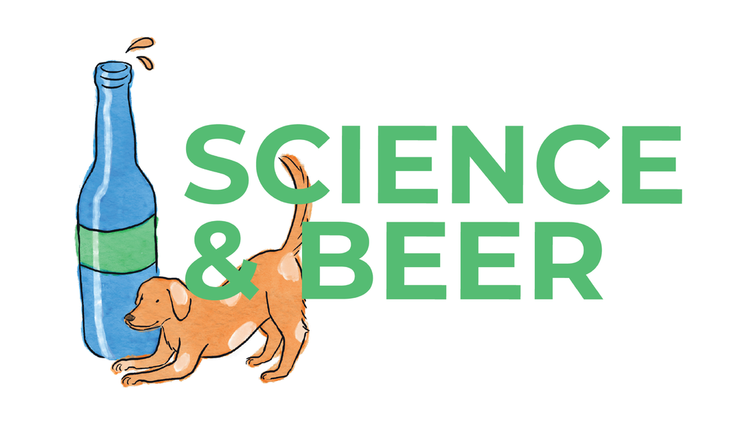
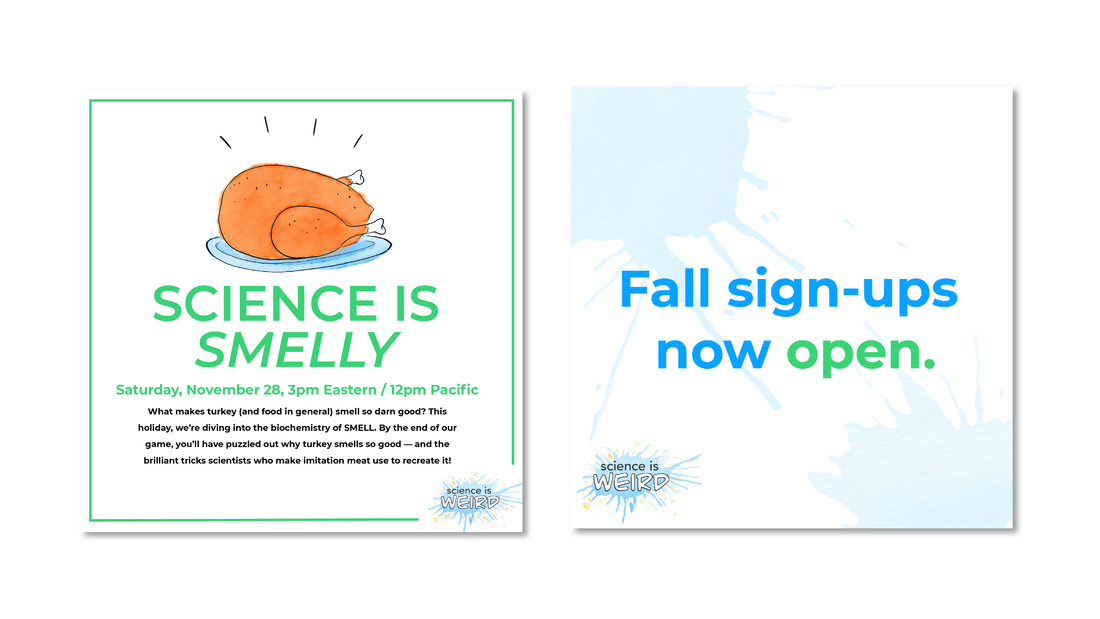
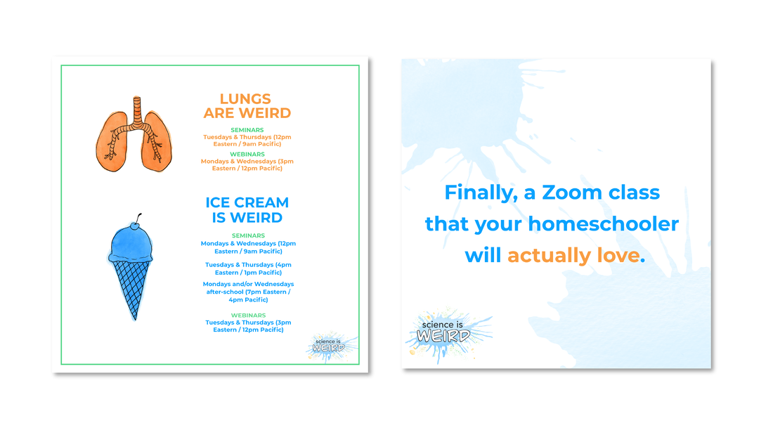
Here are some ads I created so you can see the brand in action!
Here are some ads I created so you can see the brand in action!
Thanks for reading!
